Pokémon Logo Creator Unmasked
When the president of Nintendo America suddenly calls, you don’t hesitate—you answer. That’s exactly what designer Chris Maple did in 1998 after a fellow designer tipped him off about the impending call. Back then, unexpected calls from corporate executives weren’t unusual for Maple, who ran Media Design, a Seattle-based firm specializing in high-pressure, last-minute design solutions. Though rarely credited publicly, his agency quietly built a reputation among local giants like Boeing, the Seattle Mariners, and Holland America Line.
Years into his career, Maple received a call from Nintendo of America president Minoru Arakawa’s secretary, inviting him to their Redmond office. He was told the company needed him for a game project—no further details. Intrigued, Maple accepted, unaware he’d soon play a pivotal role in launching one of the world’s biggest pop culture phenomena: Pokémon.
Pokémon Goes West
Maple recalls waiting in Nintendo’s lobby, fixated on a striking crystal horse sculpture. "You learn to read a room in corporate settings," he says. "I was sizing up the energy before I even knew what the project was." Eventually, he was led to a meeting room where Arakawa—a magnetic presence, Maple notes—explained their challenge. They were rebranding Pocket Monsters for Western audiences as Pokémon, and previous agencies had fallen short. They needed a new logo, fast.
A staffer then dumped a box of toys, sketches, and strange drawings on the table. "What is this?" Maple asked. Arakawa replied simply, "It’s Pokémon."
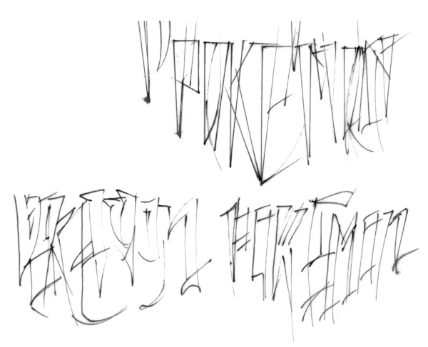
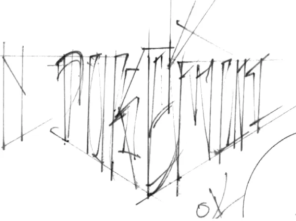
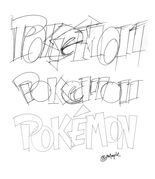
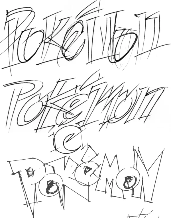
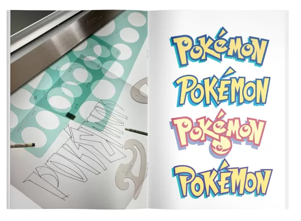
With no guidance beyond a one-month deadline, Maple began sketching variations by hand. He worked under tight constraints: the logo had to fit the Game Boy’s tiny screen and work in black-and-white. He wasn’t given games to play or much context—just that tiny Pikachu figurine and early Nintendo Power materials.
The Vanished Crystal Horse
For days, I scoured the internet for traces of Nintendo’s lobby sculpture, which Maple insists subtly influenced his design. But no videos or former employees could confirm its existence—until a tip led me to David Sheff’s book Game Over, which mentions "a crystal horse’s head in a glass case" on page 198. If you remember this artifact—or better yet, have a photo—reach me at [email protected].
The Stroke of Genius
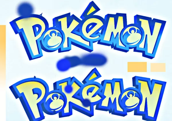
Logo designs typically take six months. Maple had four weeks. He drafted multiple options, keeping his favorite for last. At the presentation, Nintendo’s Don James broke the silence: "This is the one." After minor tweaks to the P and E, the iconic yellow-and-blue logo was finalized—just in time for Pokémon’s E3 1998 debut.
Why those colors? Maple shrugs: "It just felt right." He admits subconscious influence from the Blue and Yellow game versions, but attributes the choice to intuition.
Early Pokémon Logo Sketches
View 8 Images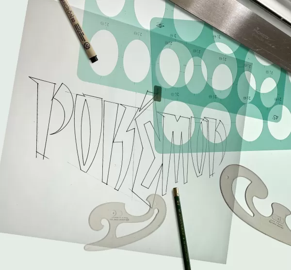
Legacy of a Logo
Months later, Maple stumbled upon a towering Toys "R" Us Pokémon display. "Holy smokes," he remembers thinking. Though his involvement ended after tweaking the logo, he later contributed to projects like Ken Griffey Jr. Baseball and Rogue Squadron.
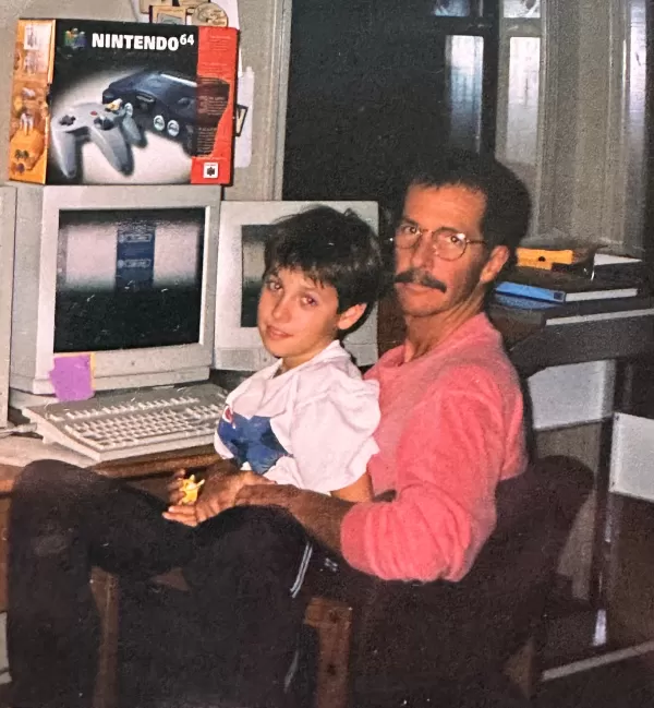
For decades, Maple stayed silent—designers rarely get credited. But recently, he decided to reclaim his role. Why now? Largely due to his son’s urging. "People deserve to know the truth," he says.
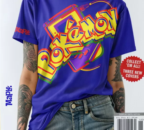
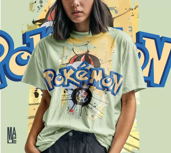
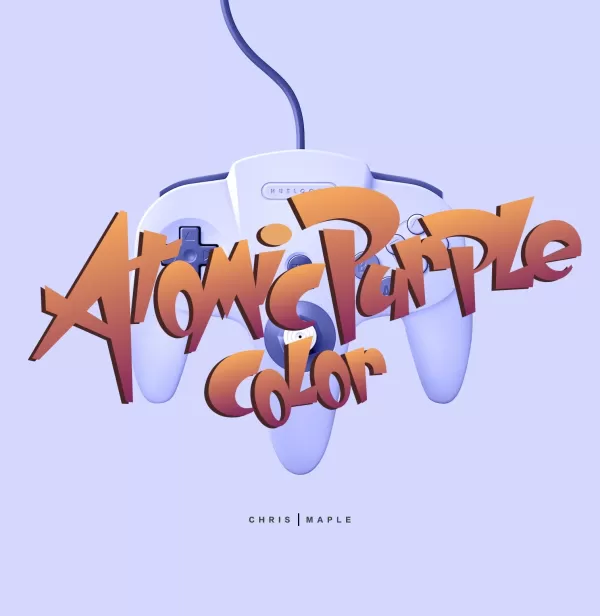
Modern Logo Mock-ups
View 4 Images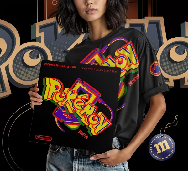
As Pokémon approaches its 30th anniversary, Maple has one request: if Nintendo updates the logo, they should consult him. "It needs tender care—not just a ’30th’ slapped on."
Does he grasp his impact? "Kids I teach go wild when they learn I designed it," he laughs. "But honestly? I’m just glad it resonated."


-
 Feb 20,25Where to Preorder the Samsung Galaxy S25 and S25 Ultra Smartphones Samsung's Galaxy S25 Series: A Deep Dive into the 2025 Lineup Samsung unveiled its highly anticipated Galaxy S25 series at this year's Unpacked event. The lineup features three models: the Galaxy S25, S25+, and S25 Ultra. Preorders are open now, with shipping commencing February 7th. Samsung's web
 -
 Jan 27,25Roblox: Bike Obby Codes (January 2025) Bike Obby: Unlock Awesome Rewards with These Roblox Codes! Bike Obby, the Roblox cycling obstacle course, lets you earn in-game currency to upgrade your bike, buy boosters, and customize your ride. Mastering the various tracks requires a top-tier bike, and thankfully, these Bike Obby codes deliver
 -
 Jan 11,25Jujutsu Kaisen Phantom Parade: Tier List Revealed This Jujutsu Kaisen Phantom Parade tier list helps free-to-play players prioritize character acquisition. Note that this ranking is subject to change with game updates. Tier List: Tier Characters S Satoru Gojo (The Strongest), Nobara Kugisaki (Girl of Steel), Yuta Okkotsu (Lend Me Your Stren
 -
 Mar 04,25The Godfeather swoops onto iOS, pre-registration open now! The Godfeather: A Pigeon-Fueled Mafia War Arrives on iOS August 15th! Pre-register now for The Godfeather: A Mafia Pigeon Saga, a roguelike puzzle-action game launching on iOS August 15th! Evade the Pidge Patrol, unleash your avian arsenal (ahem, droppings), and reclaim the neighborhood from both h
