


\"Angry Kirby\" Explained by Former Nintendo Employees
Unlocking the Mystery of "Angry Kirby": A Look at Nintendo's Localization Strategies
Former Nintendo employees shed light on the fascinating evolution of Kirby's image in Western markets, revealing the reasons behind the stark contrast between his Japanese and American portrayals. This article delves into Nintendo's localization strategies and their impact on Kirby's global branding.
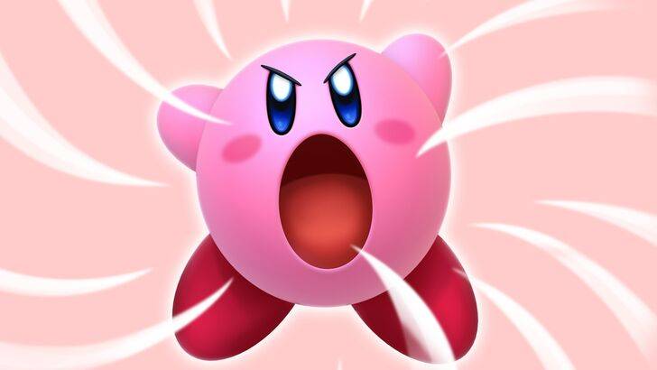
The "Angry Kirby" Phenomenon: A Western Appeal
Kirby's transformation into a "tougher" character on Western game covers and artwork, often dubbed "Angry Kirby" by fans, wasn't about anger, but about projecting determination. Leslie Swan, former Nintendo Localization Director, explained that while cute characters resonate universally in Japan, Western markets, particularly among teenage boys, favored a more rugged aesthetic. Shinya Kumazaki, director of Kirby: Triple Deluxe, corroborated this, noting that while cute Kirby drives Japanese appeal, a more battle-hardened image resonates more strongly in the US. However, he also highlighted the game-specific nature of this approach, citing Kirby Super Star Ultra's consistent box art across regions.
Marketing Kirby as "Super Tuff Pink Puff"
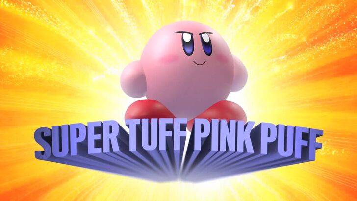
Nintendo's marketing shifted to broaden Kirby's appeal, particularly to boys. The "Super Tuff Pink Puff" campaign for Kirby Super Star Ultra on the Nintendo DS exemplifies this shift. Krysta Yang, former Nintendo of America Public Relations Manager, highlighted Nintendo's desire to shed its "kiddie" image, acknowledging the stigma associated with games perceived as solely for children. This led to a conscious effort to emphasize Kirby's combat abilities, moving away from a solely "cute" persona. While recent marketing has strived for a more balanced portrayal, Kirby's inherent cuteness remains a dominant perception.
Nintendo's US Localization Choices
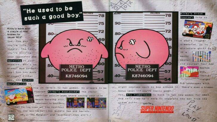
The divergence in Kirby's localization began early. A 1995 "Play It Loud" advertisement featuring a mugshot-style Kirby is a prime example. Subsequent game box art frequently showcased Kirby with sharper features and more intense expressions. Even the original Kirby's Dream Land for Game Boy featured a ghostly-white Kirby in the US, compared to his pink counterpart in Japan, a decision driven by the Game Boy's monochrome display. This early discrepancy, combined with the perceived need to appeal to a broader audience, solidified the trend of a "tougher" Kirby in Western markets. Recently, however, Nintendo's global marketing has aimed for greater consistency, presenting a more versatile image of Kirby.
A More Global Approach
Both Swan and Yang agree that Nintendo has adopted a more global perspective in recent years, fostering closer collaboration between its Japanese and American offices. This has led to more consistent marketing and localization strategies, minimizing regional variations like the contrasting Kirby box art. While this global approach ensures brand consistency, Yang acknowledges the potential downside of overlooking regional nuances, potentially leading to more generic marketing. However, the increasing familiarity of Western audiences with Japanese culture has also influenced this shift, leading to a more nuanced understanding of marketing strategies.
-
 Jan 27,25Roblox: Bike Obby Codes (January 2025) Bike Obby: Unlock Awesome Rewards with These Roblox Codes! Bike Obby, the Roblox cycling obstacle course, lets you earn in-game currency to upgrade your bike, buy boosters, and customize your ride. Mastering the various tracks requires a top-tier bike, and thankfully, these Bike Obby codes deliver
 -
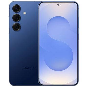 Feb 20,25Where to Preorder the Samsung Galaxy S25 and S25 Ultra Smartphones Samsung's Galaxy S25 Series: A Deep Dive into the 2025 Lineup Samsung unveiled its highly anticipated Galaxy S25 series at this year's Unpacked event. The lineup features three models: the Galaxy S25, S25+, and S25 Ultra. Preorders are open now, with shipping commencing February 7th. Samsung's web
 -
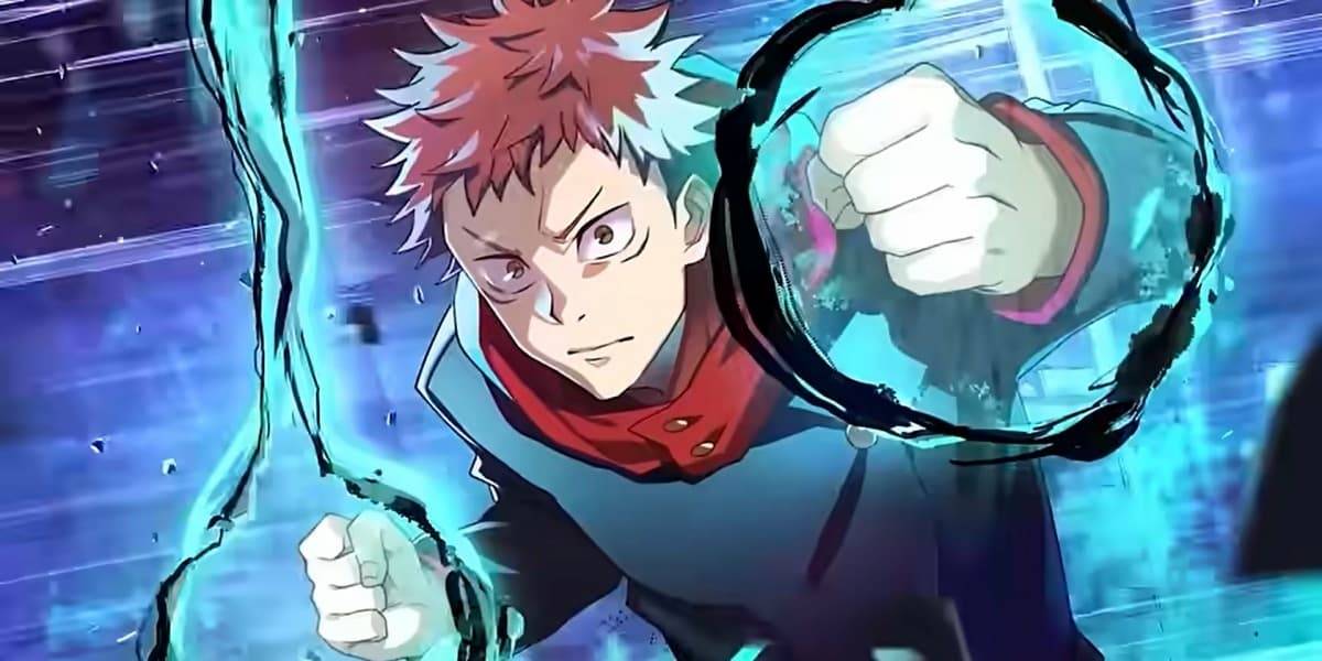 Jan 11,25Jujutsu Kaisen Phantom Parade: Tier List Revealed This Jujutsu Kaisen Phantom Parade tier list helps free-to-play players prioritize character acquisition. Note that this ranking is subject to change with game updates. Tier List: Tier Characters S Satoru Gojo (The Strongest), Nobara Kugisaki (Girl of Steel), Yuta Okkotsu (Lend Me Your Stren
 -
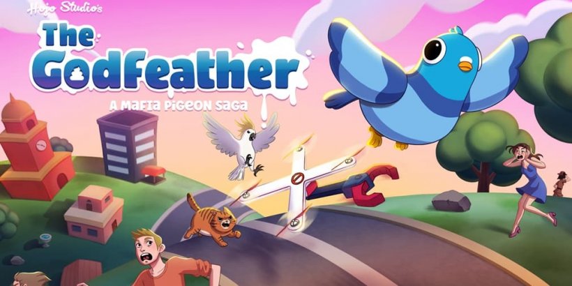 Mar 04,25The Godfeather swoops onto iOS, pre-registration open now! The Godfeather: A Pigeon-Fueled Mafia War Arrives on iOS August 15th! Pre-register now for The Godfeather: A Mafia Pigeon Saga, a roguelike puzzle-action game launching on iOS August 15th! Evade the Pidge Patrol, unleash your avian arsenal (ahem, droppings), and reclaim the neighborhood from both h