






Civilization VII UI Draws Criticism

Sid Meier's Civilization VII Deluxe Edition has been available for just one day, yet online discussions are already filled with critiques of its user interface and other perceived shortcomings. But is the UI genuinely as problematic as many claim? This article provides a detailed analysis of the game's interface elements to determine if the criticism is warranted.
← Return to Sid Meier's Civilization VII main article
Analyzing Civilization VII's User Interface
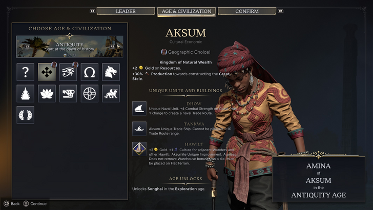
For players who purchased the Deluxe or Founder's Editions, Civilization VII has been playable for less than 24 hours, but it's already facing significant criticism—especially regarding its user interface and the absence of certain quality-of-life features. While it's easy to join the chorus of disapproval, it's more constructive to evaluate the UI objectively against established standards for 4X strategy games. By breaking down its components, we can assess whether it is genuinely ineffective or simply different.
Principles of an Effective 4X Game Interface
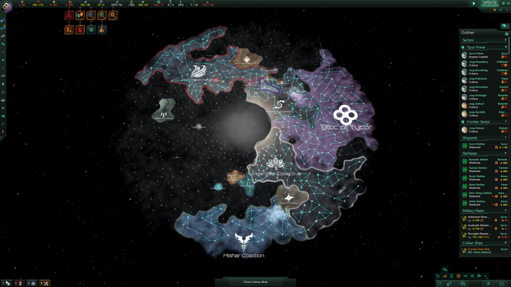
While some argue that 4X UI design has objective rules, the reality is more flexible. A game's interface must align with its specific goals, mechanics, and visual style, meaning that a one-size-fits-all approach rarely works. That said, experienced designers have identified several common traits shared by the most successful 4X interfaces. These principles generally contribute to a more intuitive and engaging player experience.
With these benchmarks in mind, let's examine how Civilization VII's UI measures up to widely accepted standards for clarity, functionality, and visual design.
Clear Information Hierarchy
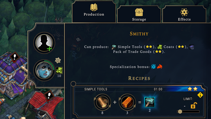
An effective information hierarchy presents game data in a way that prioritizes what players need most frequently. Essential resources and mechanics should be readily accessible, while secondary information remains available but less prominent. A well-designed interface doesn't overwhelm the player with data; it organizes it logically based on relevance and usage patterns.
A strong example is the building management menu in Against the Storm. Right-clicking any structure opens a multi-tab pop-up that groups functions by importance. The default tab includes common actions like assigning workers and setting production priorities. Less frequently used options, such as inventory management or late-game systems, are placed in separate tabs, reducing clutter without sacrificing functionality.
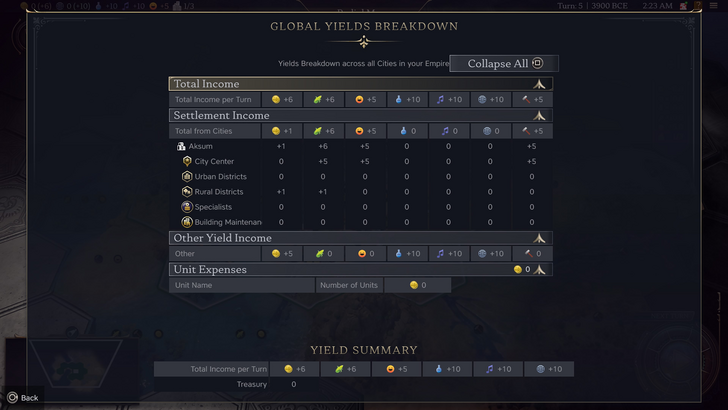
When applied to Civilization VII's resource overview, the interface is functional but could be improved. The summary screen displays empire-wide resource allocation through dropdown menus, categorizing data into income, yields, and expenses. It presents information in a clean table format and allows players to collapse sections as needed.
However, the UI lacks deeper detail. While it shows resource contributions from rural districts, it doesn't specify which individual districts or tiles are responsible. Expense tracking is also limited, primarily covering unit upkeep while omitting other costs. Overall, the resource UI serves its basic purpose but would benefit from greater granularity.
Effective and Efficient Visual Indicators
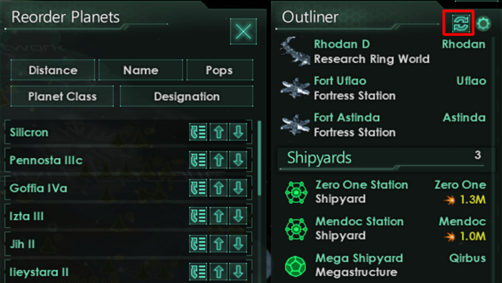
Visual indicators use icons, colors, or symbols to convey information quickly, minimizing the need for text. A strong UI employs these elements to help players understand game states at a glance, improving efficiency and reducing cognitive load.
Stellaris, despite its sometimes cluttered interface, excels in this area with its Outliner panel. Icons next to planets and ships instantly communicate their status—whether a vessel is surveying, in orbit, or idle—without requiring players to open additional menus.
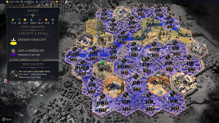
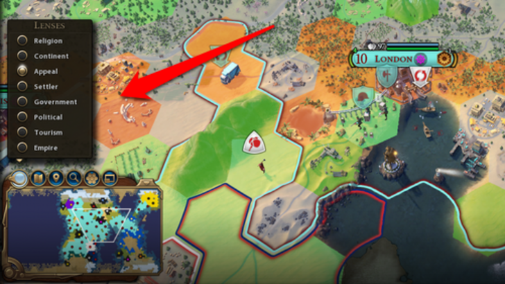
Civilization VII also uses visual cues, such as tile yield overlays that display resources available on each hex and color-coded settlement suitability indicators. However, players have noted the absence of certain lenses from Civilization VI, such as those for tourism or loyalty, which were tied to mechanics unique to that entry. The lack of customizable map pins has also been a point of criticism. While the visual design is not without merit, there is clear room for enhancement.
Searching, Filtering, and Sorting Options
As 4X games grow in complexity, robust search and filtering tools become essential for managing information overload. Features like search bars, sortable columns, and visual filters allow players to quickly locate specific units, resources, or map features, streamlining gameplay and reducing frustration.
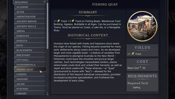
Civilization VI set a high standard with its comprehensive search function, which could highlight resources, tiles, or units across the entire map. Its Civilopedia also linked directly to in-game entities, enabling seamless transitions between reference material and gameplay.
Regrettably, Civilization VII lacks an equivalent search tool, a omission widely regarded as a significant UI shortcoming. Given the scale of the game, this absence impacts usability. Many players hope that future updates will reintroduce this feature, ideally with enhanced integration with the Civilopedia.
Design and Visual Consistency
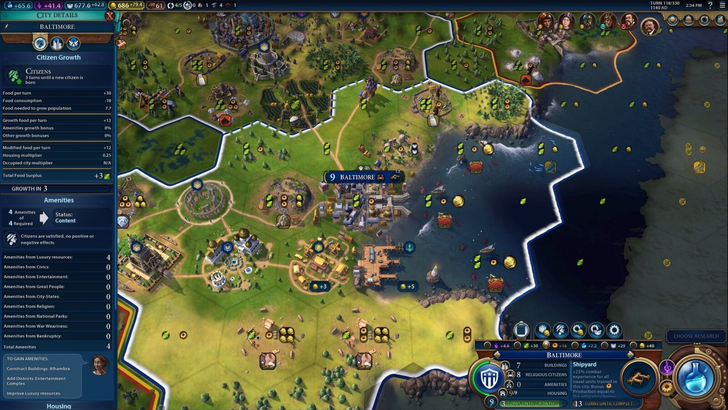
A cohesive visual theme reinforces a game's identity and improves usability. When UI elements share a consistent style, color palette, and layout, the interface feels like a natural extension of the game world rather than a disconnected overlay.
Civilization VI excelled in this regard with its dynamic, map-like interface that complemented the game's art direction. Every component—from leader screens to trade menus—felt unified and thematic.
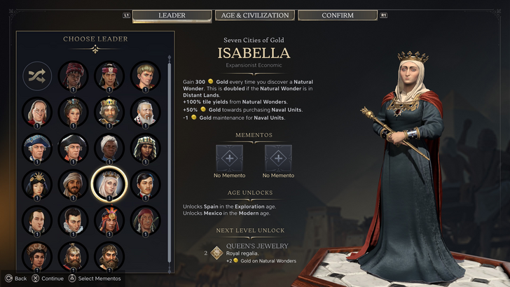
Civilization VII adopts a more minimalist and refined aesthetic, using a black and gold color scheme to convey sophistication. While the design is deliberate and professionally executed, its subdued approach has received mixed reactions. Some players find it less immediately engaging than its predecessor's vibrant style. Ultimately, visual preference is subjective, and the UI's thematic consistency is a matter of personal taste.
Final Assessment
Functional Yet Flawed: A Balanced Perspective

After evaluating Civilization VII's UI against key design principles, it's clear that while the interface has shortcomings, it is far from the disaster some describe. The most significant omission is a robust search function, which hinders navigation in the late game. However, the UI generally performs its core functions adequately.
When compared to other 4X titles, Civilization VII's interface may not be the most innovative or visually striking, but it supports gameplay effectively enough. The overall strength of the game compensates for the interface's limitations, and with future updates, it has the potential to win over skeptics. In its current state, it is a serviceable, if imperfect, component of an otherwise compelling strategy experience.
← Return to Sid Meier's Civilization VII main article
Games Similar to Sid Meier's Civilization VII

-
 Mar 01,25Trading Features Guide for Pokémon TCG Pocket Mastering Pokémon TCG Pocket's Trading System: A Comprehensive Guide Expand your Pokémon TCG Pocket collection, optimize your deck, and connect with fellow players through the exciting trading system. This guide covers key trading features, effective strategies, and tips for maximizing your trading
 -
 May 14,25Pokémon Presents 2025 Unveils Exciting New Reveals Pokémon Presents 2025, held on February 27, once again delighted fans with a host of exciting news. Unexpected announcements, details about the upcoming Pokémon Legends: Z-A, new fighters in beloved games, updates on the franchise’s TV series, and events across various titles — all of this was cover
 -
 May 06,25"New RPG Isekai∞Isekai Launches with Nine Anime Worlds to Explore" Do you love isekai animes and wish you could play your favorite ones as games on the same platform at once? Colopl has made your dreams come true with their new game, Isekai∞Isekai, which is now available on Android. However, it's important to note that this isn't a global release yet; it's currentl
 -
 Jan 27,25Discover the Enigmatic Pokémon Vending Machines: Unveiling Their Wonders Discover the World of Pokémon Vending Machines: A Comprehensive Guide Pokémon fans are buzzing about the increasing presence of Pokémon vending machines across the US. This guide answers your burning questions about these automated merchandise dispensers. What are Pokémon Vending Machines? Pokémon